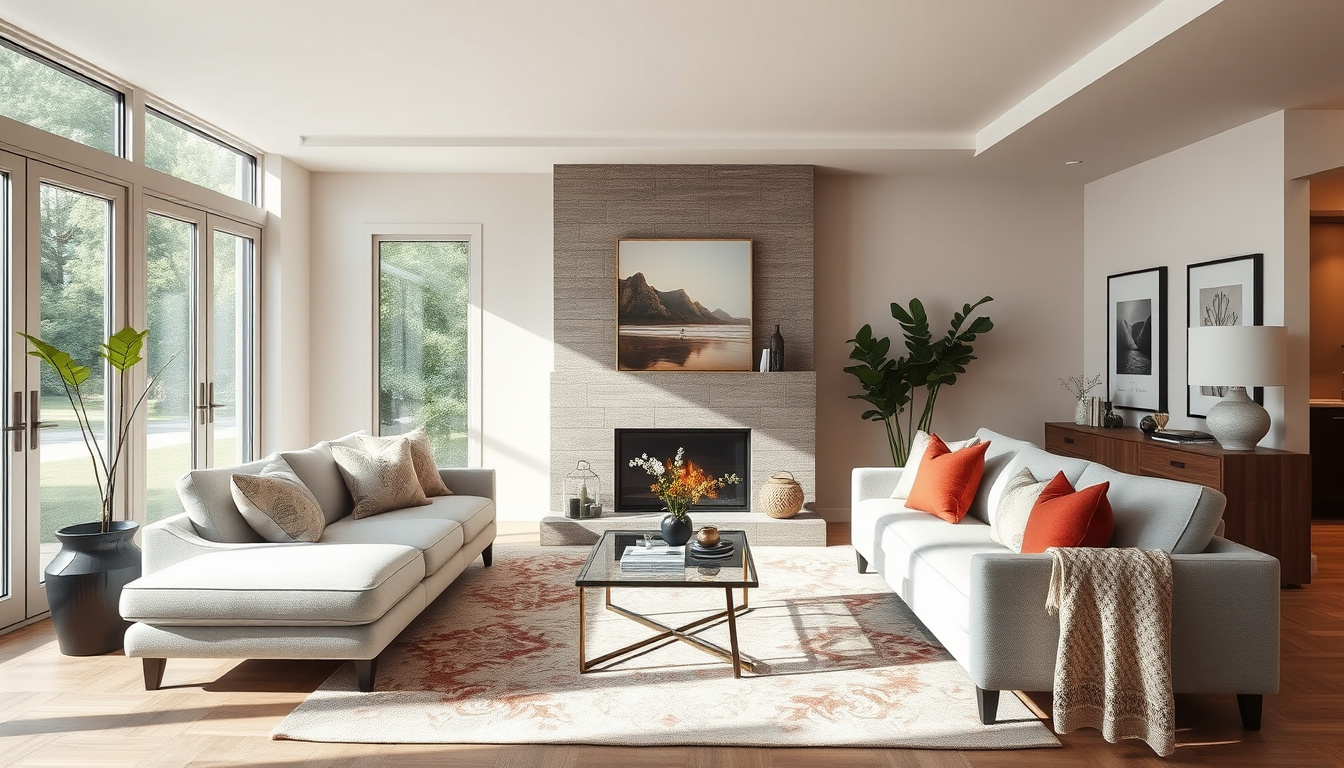
Anyone who’s rearranged a living room knows the instinct: push the sofa flush to the wall, center the rug, fill every corner. Yet experienced designers rely on a handful of counterintuitive rules — odd-number groupings, proportional ratios, and strategic floating — that consistently create better flow. One of the most useful guidelines, the 60-30-10 color rule from Decorilla (interior design platform), helps keep any palette balanced and intentional.
60-30-10 Rule: 60% dominant color ·
Color Palette Size: 3–5 colors recommended ·
Fifth Wall: Ceiling color affects room mood
Quick snapshot
- Stick to three to five colors for harmony (Decorilla)
- Include at least one neutral to balance bold hues (Decorilla)
- More colors can make a room feel chaotic (Decorilla)
- Treat the ceiling as a supporting color layer (Homes & Gardens)
- Lighter ceilings open the room, darker ones add coziness (Homes & Gardens)
- Consistent undertone with wall shades (Homes & Gardens)
- Start with saved inspiration images (Style by Emily Henderson)
- Identify three to five recurring colors from your references (Style by Emily Henderson)
- Test swatches on walls, floors, and furniture before painting (Style by Emily Henderson)
Six key color facts, one pattern: the most effective living room schemes rest on simple numerical rules backed by design experts.
| Label | Value |
|---|---|
| 60‑30‑10 color rule | Dominant 60%, secondary 30%, accent 10% (Decorilla) |
| Recommended palette size | 3–5 colors total including neutrals (Decorilla) |
| Ceiling as fifth wall | Adjust ceiling color to match room temperature and mood (Homes & Gardens) |
| Test before committing | Apply swatches on walls, floors, and furniture before full painting (Homes & Gardens) |
| Color emotion – cool tones | Green and blue feel calm and serene (Decorilla) |
| Color emotion – warm tones | Red and yellow feel energetic and vibrant (Decorilla) |
| Natural light assessment | Check how daylight changes wall tones throughout the day (Homes & Gardens) |
| Mood board benefit | Narrows paint choices and defines room feel (Homes & Gardens) |
What is the 60‑30‑10 rule in decorating?
A widely repeated living‑room color guideline is the 60‑30‑10 rule: one dominant color covers about 60% of the room, a secondary color about 30%, and an accent color about 10%. As Decorilla (interior design platform) explains, this proportion stops any single color from overwhelming the space while giving the accent a chance to pop. Homes & Gardens calls the rule a “useful guide” for achieving balance among room colors.
How to apply the 60‑30‑10 rule to walls and furniture
- The 60% layer is usually your walls, largest rug, or main sofa – choose a color you’re comfortable living with.
- The 30% layer comes from secondary seating, curtains, or an accent wall – it should complement the dominant hue without competing.
- The 10% layer is for punches: throw pillows, art, a vase, or a lamp shade. Style by Emily Henderson recommends using the final 10% for metallic accents or a bold statement piece.
Examples of 60‑30‑10 in living rooms
- Blue walls (60%), beige sofa and curtains (30%), gold lamp and red pillows (10%).
- Gray sectional (60%), white walls and cream rug (30%), navy throw cushions and green plant (10%).
The pattern: these proportions give each colour a distinct role, preventing visual noise without sacrificing personality.
What is the 3-5-7 rule in decorating?
The 3-5-7 rule is a variation on odd-number grouping: arrange objects in groups of 3, 5, or 7 for a dynamic visual rhythm. It is less common than the 60-30-10 color rule but some designers use it for shelf styling, mantels, and coffee tables.
- Group objects in odd numbers – they create a natural focal point that feels balanced but not stiff.
- Start with one large focal piece, then layer smaller items around it.
- Works on shelves, mantels, coffee tables, and wall art arrangements.
The implication: odd numbers break symmetry in a way that invites the eye to travel across the arrangement rather than settling in the centre.
What two colors go well together in a living room?
Decorilla notes that blue and white remains a classic combination, often chosen for its calm, airy feel. Gray and yellow offers a modern contrast, with the warmth of yellow balancing cooler gray. Navy and blush has gained popularity for a contemporary touch. Homes & Gardens adds that many successful schemes use three colors total: one main and two accent shades.
Top ten color combinations from KRAFT Paints
- Blue + white – timeless and serene.
- Gray + yellow – energetic yet grounded.
- Navy + blush – deep and soft for a modern feel.
- Green + beige – earthy and relaxing.
- Charcoal + mustard – bold and inviting.
- Soft pink + taupe – romantic and subtle.
- Teal + sand – tropical but refined.
- Burgundy + cream – rich and traditional.
- Light blue + warm white – fresh and open.
- Lavender + gray – gentle and sophisticated.
How to pair neutral bases with accent colors
Start with a neutral base (white, beige, or gray) for walls and large furniture. This covers the 60% rule. Then add a secondary neutral in a lighter or darker shade. Finally, introduce one or two accent colors through pillows, art, or a single piece of furniture. Afloral (home styling resource) recommends using the color wheel and understanding tints and shades to fine‑tune the palette.
Homeowners often rush to add a third or fourth accent. The more effective move: limit yourself to one strong accent and use neutrals as the supporting cast. The trade-off is a quieter room that feels deliberately pulled together, not overloaded.
What this means: a restrained palette with one punch colour reads as intentional rather than chaotic.
What is the correct order to decorate a room?
Professional decorators follow a top‑to‑bottom workflow that prevents rework. Homes & Gardens advises starting with the ceiling – the “fifth wall” – because its color sets the room’s overall temperature. Next come walls, then trim and doors. Flooring should be chosen after wall colors so undertones match. Finally, furniture and accessories arrive last, once the backdrop is fixed.
From ceiling to wall painting: step‑by‑step workflow
- Ceiling: Paint first, choosing a shade that supports the room’s mood – lighter to expand, darker to cozy.
- Walls: Apply wall color after the ceiling is dry. Homes & Gardens stresses testing swatches in natural light throughout the day.
- Trim and doors: Typically white or a slightly lighter version of the wall color.
- Flooring: Rugs or hard flooring should complement the wall and ceiling undertones.
- Furniture & accessories: Bring in the 60‑30‑10 rule – largest piece first, then accent pieces.
Why starting with a mood board saves time
Style by Emily Henderson suggests collecting inspiration images first. Identify recurring colors and build a palette from those. This prevents buying paint only to realize it clashes with the sofa you already own. Homes & Gardens agrees: a mood board narrows color choices and sets the room’s direction before any paint touches the wall.
Skipping the order can trap you in a redesign loop. A homeowner who picks a sofa first may then struggle to find a wall color that complements it. The designer’s sequence locks in the hardest decisions early.
The catch: every layer you skip adds potential conflict; the sequence is a safety net.
What makes a home look outdated?
According to a designer quoted by HSA Home Warranty (home warranty company), builder‑grade flush‑mount light fixtures are the single biggest giveaway that a room hasn’t been updated in years. Other common dated elements include popcorn ceilings, heavy drapes, and generic furniture styles. Decorilla warns that too much bold color or too much neutrality can also signal an outdated approach.
Five things that can make a house look outdated
- Builder‑grade flush‑mount light fixtures – replace with pendants or chandeliers.
- Popcorn ceilings – skim coating or covering with wood planks modernizes instantly.
- Heavy, floor‑length drapes – swap to sheer or Roman shades for a lighter feel.
- Outdated electronics (giant TV consoles, bulky speakers) – hide or replace with minimalist media units.
- Generic furniture suites – mix eras and avoid matched sets.
How to modernize a living room without renovation
- Update light fixtures – one or two well‑chosen pendants transform the room.
- Paint the ceiling a lighter shade – instantly lifts the space.
- Swap throw pillows and blankets – introduce a current color combination.
- Replace the coffee table with a lighter, more sculptural piece.
- Add a large piece of art that anchors the room visually.
No single fix is a silver bullet. A homeowner who swaps only the light fixtures but keeps popcorn ceilings and heavy drapes will still feel dated. The most effective approach: tackle the three biggest eyesores first – lighting, ceiling texture, and window treatments.
The implication: addressing multiple dated elements in parallel yields the biggest visual shift.
Is it okay to put a sofa against a wall?
Designers generally advise against pushing every piece of furniture against the wall. Pulling the sofa away – even just 12 inches – creates a natural conversation zone and makes the room feel larger. Decorilla notes that floating furniture opens up small spaces. However, in very compact rooms (under 12 feet wide), a sofa against the wall is acceptable if it leaves enough floor area for a coffee table and walking path.
Why designers avoid the furniture‑against‑the‑wall layout
- Pushing everything against the walls creates a “waiting room” effect – no human‑scale grouping.
- Floating the sofa establishes a focal point (often the coffee table or fireplace).
- Leaving space behind the sofa allows for a narrow console table, adding storage and visual depth.
When pushing a sofa to the wall is acceptable
- In a room that serves as a pass‑through, with no other seating arrangement possible.
- If the wall is a room divider or the back of the sofa defines a separate zone.
- When the primary function is not conversation but media viewing (e.g., a home theater setup).
What this means: context determines whether the rule applies – room dimensions trump blanket maxims.
What is the 2/3 rule for living rooms?
The 2/3 rule helps maintain proportional relationships between furniture and its surroundings. Homes & Gardens doesn’t cover it explicitly, but the principle is widely taught in interior design programs: a sofa should be about 2/3 the length of the wall it sits against; a rug should be 2/3 the length of the sofa; and a coffee table should be 2/3 the length of the sofa.
What is the 2/3 rule for sofas?
- Sofa length ≈ 2/3 of the wall length – prevents the sofa from overwhelming the wall or looking too small.
- Rug length ≈ 2/3 of the sofa length – the rug should anchor the seating area without extending too far.
- Coffee table length ≈ 2/3 of the sofa length – leaves enough walkway and keeps the table in proportion.
How to apply proportions to rugs and coffee tables
- Measure the wall, then choose a sofa that fills roughly two‑thirds.
- Select a rug that extends at least six inches beyond the sofa on each side (if floating) or aligns with the sofa front legs.
- Place a coffee table that is about two‑thirds the sofa length, centered in front.
The 2/3 rule is a “safe” proportion – it never feels too big or too small. Homeowners who ignore it often end up with a sofa that swallows a small wall or a tiny rug that floats awkwardly. The correction is usually simple: measure before you buy.
The implication: proportion is the invisible backbone of a well‑sized room; the 2/3 ratio is a reliable starting point.
Clarity: what we know and what remains uncertain
Confirmed facts
- The 60‑30‑10 rule uses color proportions of 60%, 30%, 10% (Decorilla)
- 3–5 colors per palette is recommended (Decorilla, Style by Emily Henderson)
- Floating furniture away from walls opens up small spaces (Decorilla)
- Cool tones (green, blue) feel calm; warm tones (red, yellow) feel energetic (Decorilla)
- Ceiling color influences room mood (Homes & Gardens)
What’s unclear
- Whether the 3‑5‑7 rule is universally effective in all room sizes (no large‑scale study found)
- Exact percentage of designers who reject wall‑pushed sofas (anecdotal evidence only)
- How the 2/3 rule applies to non‑rectangular rooms (curved walls, open plans)
- How the 60‑30‑10 rule interacts with natural light variations across seasons
- Whether the 2/3 rule applies to curved walls in open‑plan layouts
What’s next
Design rules like 60‑30‑10 and the 2/3 proportion are heuristics, not laws. The next step for any homeowner is to test them in their own space. Try one rule at a time: start with the 60‑30‑10 color proportion on your walls, rugs, and accessories. If the room still feels off, apply the 2/3 rule to your sofa and rug sizes. Small adjustments – floating a sofa six inches, swapping a coffee table – can change a room’s entire feel without a renovation.
“Builder‑grade light fixtures are the single biggest clue a room hasn’t been updated in years. Changing the ceiling light makes more difference than any new rug.”
— Design consultant quoted by HSA Home Warranty
“Blue and white is a classic combination that works in any living room. It’s forgiving, timeless, and easy to layer with other colors.”
— Color specialist at KRAFT Paints
Frequently asked questions
What is the 3‑4‑5 rule in decorating?
The 3‑4‑5 rule is a variation on odd‑number grouping: arrange objects in sets of 3, 4, and 5 for a dynamic visual rhythm. It’s less common than the 60‑30‑10 color rule but some designers use it for shelf styling.
How do I choose a color scheme for my living room?
Start with a mood board from saved images. Identify 3‑5 recurring colors. Apply the 60‑30‑10 proportion: 60% neutral or main color, 30% secondary, 10% accent. Test swatches in natural light before painting.
What are the most common living room design mistakes?
Pushing all furniture against walls, using builder‑grade lighting, ignoring ceiling color, overloading the palette, and buying a sofa that is too big or too small for the space.
Should I paint my living room ceiling a different color?
Yes – treat the ceiling as the “fifth wall.” A lighter ceiling makes the room feel taller; a darker ceiling adds coziness. Keep the undertone consistent with your wall color.
How often should I update my living room decor?
Soft furnishings (pillows, throws) can be updated every 1‑2 seasons. Major elements (sofa, rug, wall color) typically last 5‑10 years. Replace fixtures when they start to feel dated.
Can I mix modern and traditional furniture?
Yes – mixing styles adds character. Keep a common color thread and balance proportions. A traditional sofa with a modern coffee table works if both share one or two undertones.
What type of lighting is best for a living room?
Layer three types: ambient (overhead or ceiling), task (floor or table lamps), and accent (spotlight on art). Replace builder‑grade flush mounts with statement pendants or chandeliers.
Related reading
- How to choose paint colors for your living room
- The ultimate guide to living room layouts
- 5 budget‑friendly living room makeover ideas
- Why the 60‑30‑10 rule works in every room
A living room is not a showroom. The most effective decor ideas are the ones that make the space work for how you actually live. For the homeowner starting a makeover, the choice is clear: pick one rule, test it, adjust. For the design enthusiast, combine the 60‑30‑10 color rule with the 2/3 proportion rule and watch a so‑so room become intentional.
Related stories





Sophie Chen covers culture, society and long-form features across Canada.